Posts Tagged ‘design’
Jul 12
Mixing autumn
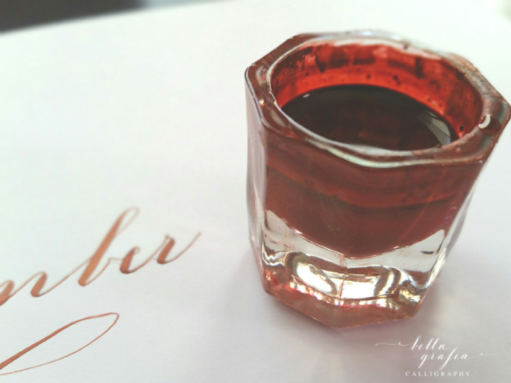
One of the best parts of being a calligrapher is that I get to play with ink and call it work. Yesterday, I was working on plans for the fall calligraphy workshops I’m putting together, and since I want the class materials to reflect the season, pretty falls colors were on my mind.
I’m obsessed now with the color I created and want to add it to everything. This rich, deep, coppery color is the glorious love child of two of my favorite inks—Dr. Ph Martin’s Copper Plate Gold (iridescent) and Ziller Buffalo Brown. It’s more red than copper, but that depends on the light, too.
If you’re wondering about the formula, I’m not much help there. Mix a bit of the buffalo brown and a little less of the copper plate gold and stir until the color takes your breath away. That’s pretty much it.
If I had to name the color, I guess I would just have to call it November. It’s high summer here in the Phoenix area, but this ink doesn’t know any better.
Thank goodness for that.