Apr 06
Make, believe
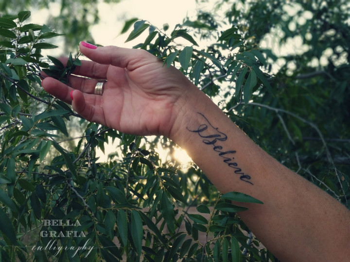
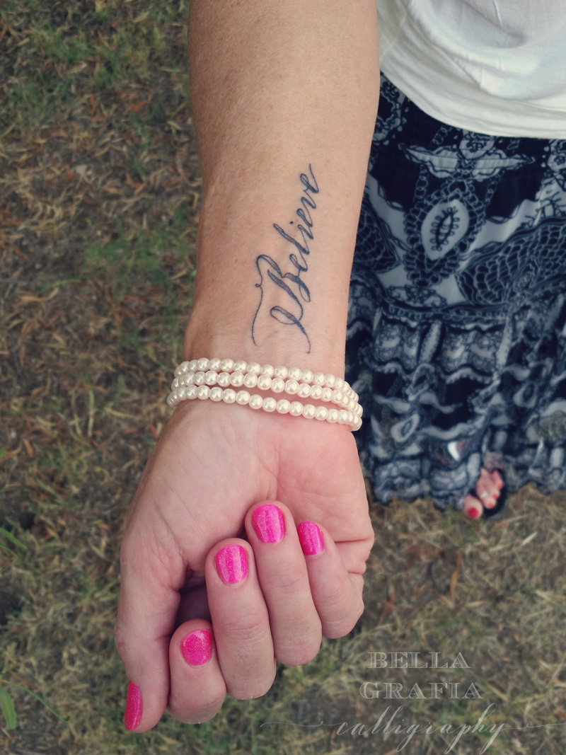
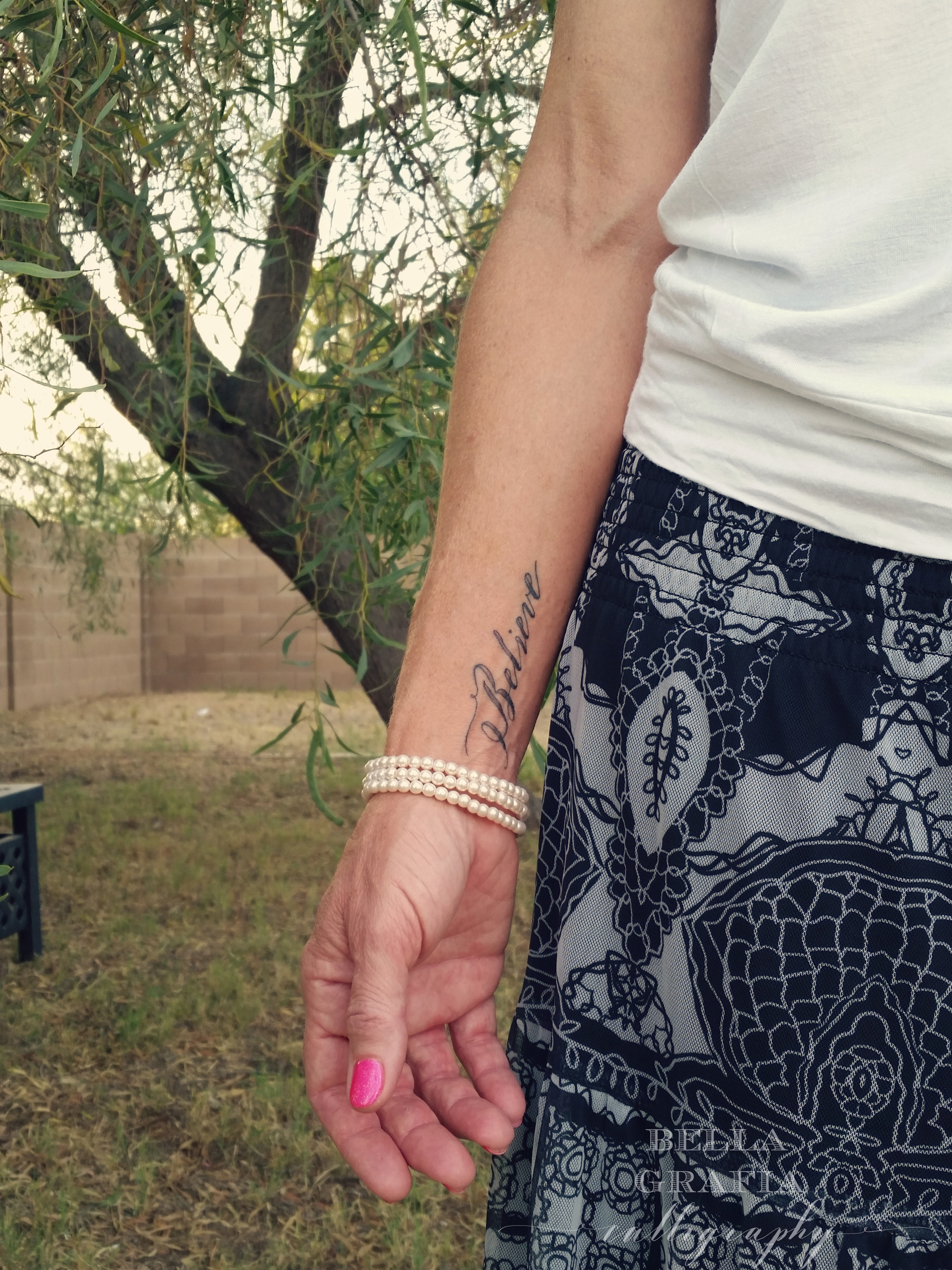
When Robin asked if I would design a calligraphy tattoo for her using one of her favorite words, I was delighted (and excited). Her birthday was coming up soon, and she wanted to mark the occasion with a meaningful and lovely tattoo. The word she wanted: Believe.
For her, so much of life and how we move forward, with faith that all will be well again, is rooted in that one simple word. Believe.
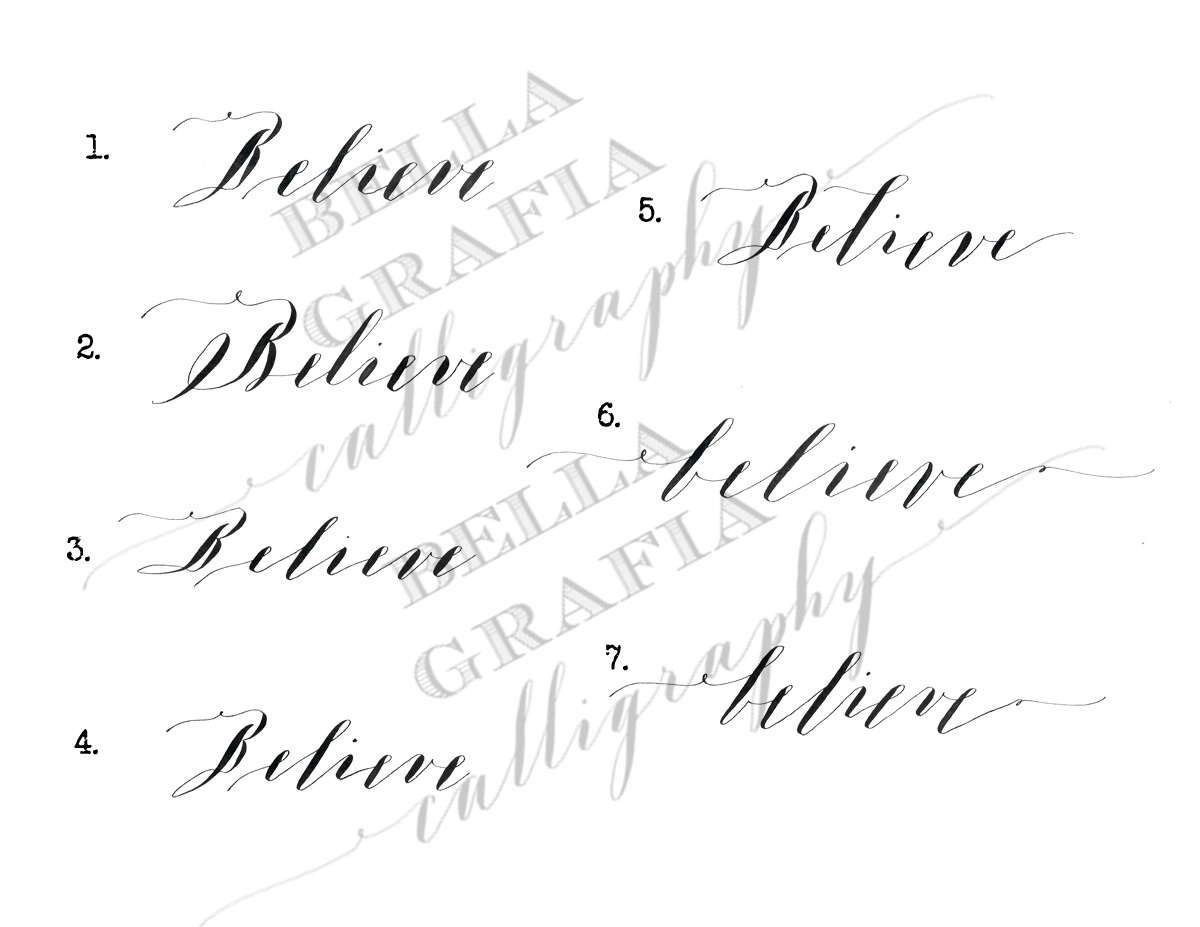
Using my longtime favorite nib, the Brause Extra Fine 66, I wrote out the word in eight different variations of calligraphy—including two all-lowercase options—and sent them to her.
{ click to enlarge }
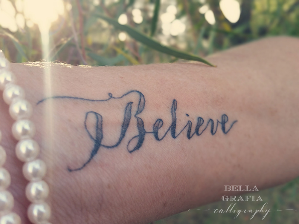
She ended up choosing style #2, and within just a couple of days, the word was on her wrist. It’s a beautiful talisman for her, and she loves how it turned out (I do, too!).
It’s a lovely thing to see my calligraphy translated into such a permanent medium. It’s an honor, too. A tattoo is such a personal mark, and I was delighted that Robin would choose my calligraphy for this one.
Jul 12
Mixing autumn
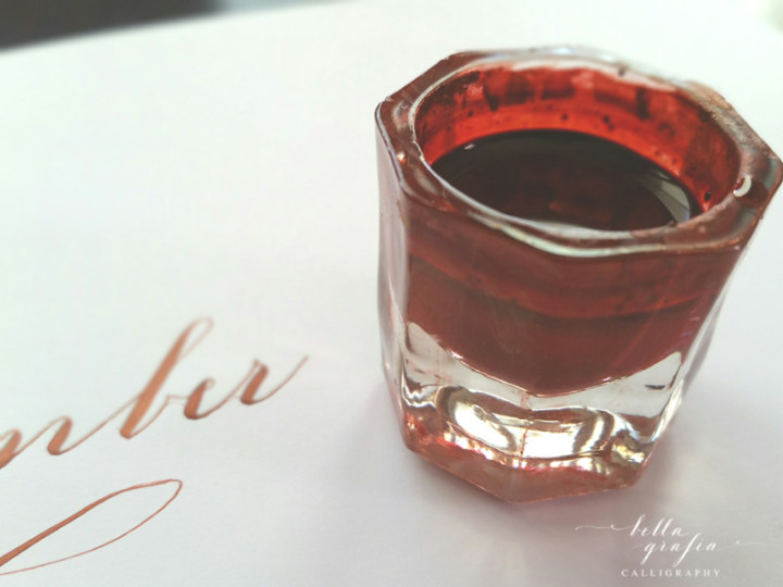
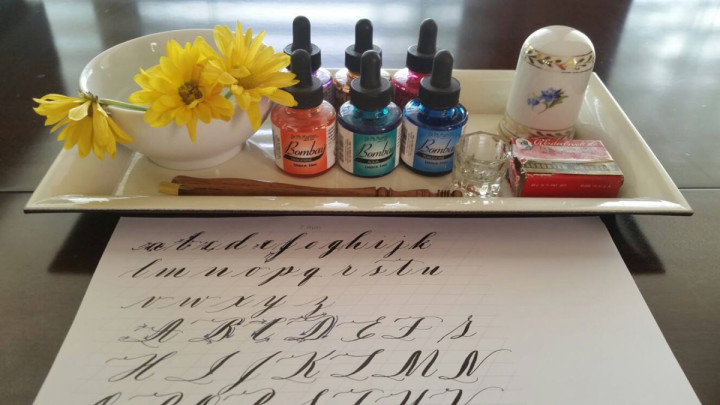
One of the best parts of being a calligrapher is that I get to play with ink and call it work. Yesterday, I was working on plans for the fall calligraphy workshops I’m putting together, and since I want the class materials to reflect the season, pretty falls colors were on my mind.
I’m obsessed now with the color I created and want to add it to everything. This rich, deep, coppery color is the glorious love child of two of my favorite inks—Dr. Ph Martin’s Copper Plate Gold (iridescent) and Ziller Buffalo Brown. It’s more red than copper, but that depends on the light, too.
If you’re wondering about the formula, I’m not much help there. Mix a bit of the buffalo brown and a little less of the copper plate gold and stir until the color takes your breath away. That’s pretty much it.
If I had to name the color, I guess I would just have to call it November. It’s high summer here in the Phoenix area, but this ink doesn’t know any better.
Thank goodness for that.
Jul 11
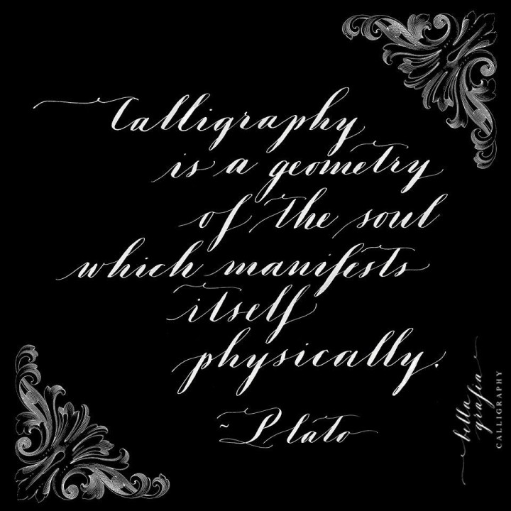
A geometry of the soul
I just love this quote so much.
Jul 03
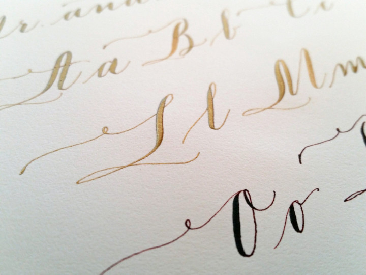
Midas touch
If I had to choose a favorite ink color, that would be pretty close to impossible. But I have to say that this copper plate gold from Dr. Ph Martin’s easily makes the top three. The flow is beautiful; the color is gorgeous. And the loveliest detail is that you can actually feel the texture of the ink on top of the paper. I can never resist running my hand over the first sample once the ink has dried.
(The brown ink at the bottom is another favorite: Buffalo Brown by Ziller Ink.)
Jul 01
Turquoise ink on black
Jul 01
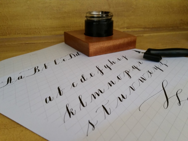
Calligraphy lesson
